Architecture
Understanding the architecture and design of Vyuh Node Flow
Vyuh Node Flow is built with a layered architecture that separates concerns and provides a flexible, extensible foundation for building node-based editors.
High-Level Overview
The NodeFlowEditor is the core widget that is used to manipulate the
entire node graph. Its companion object is the NodeFlowController,
providing the API and infrastructure for manipulating the node graph.
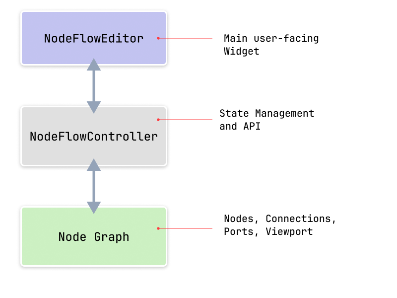
Core Components
1. NodeFlowEditor
The main widget that renders the interactive flow editor.
- Manages the visual rendering of the graph
- Handles user interactions (panning, zooming, selecting)
- Delegates to specialized layers for rendering different aspects
- Provides callbacks for user actions
2. NodeFlowController
The controller manages the graph state and provides APIs for manipulation:
class NodeFlowController<T extends NodeData> {
  // Core graph data
  final Graph<T> graph;
  final Viewport viewport;

  // APIs
  void addNode(Node<T> node);
  void removeNode(String nodeId);
  void addConnection(Connection connection);
  void removeConnection(String connectionId);

  // Selection
  Set<String> get selectedNodeIds;
  void selectNode(String nodeId, {bool multiSelect = false});

  // Viewport management
  void panTo(Offset position);
  void zoomTo(double zoom);
  void fitToScreen();

  // And many more...
}
Key responsibilities:
- State Management: Uses MobX observables for reactive updates
- Graph Operations: CRUD operations on nodes and connections
- Selection Management: Multi-select support
- Keyboard Shortcuts: Extensible keyboard shortcuts
- Viewport Control: Panning and zooming
3. NodeGraph
An immutable data class for graph serialization and deserialization. All state management is handled by the NodeFlowController:
class NodeGraph<T> {
  final List<Node<T>> nodes;
  final List<Connection> connections;
  final List<Annotation> annotations;
  final GraphViewport viewport;
  final Map<String, dynamic> metadata;

}
4. Node
Represents a single node in the graph with reactive state management:
class Node<T> {
  final String id;
  final String type;
  final T data;

  // Observable properties
  final Observable<Offset> position;
  final Observable<Offset> visualPosition;
  final Observable<Size> size;
  final Observable<int> zIndex;
  final Observable<bool> selected;
  final Observable<bool> dragging;

  // Port lists
  final ObservableList<Port> inputPorts;
  final ObservableList<Port> outputPorts;

}
Key Features:
- Generic data type
Tfor custom node information - MobX observables for reactive position, size, z-index, and state
- Separate
position(logical) andvisualPosition(for snap-to-grid) - Observable lists for dynamic port management
- Support for shaped nodes via
NodeShape
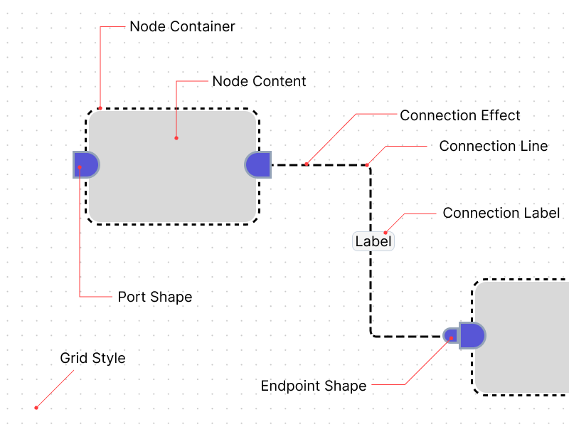
5. Port
Connection points on nodes with extensive customization:
class Port {
  final String id;
  final String name;
  final PortPosition position; // left, right, top, bottom
  final PortType type; // source, target, both
  final Offset offset;
  final bool multiConnections;
  final int? maxConnections;
  final PortShape shape;
  final double size;
  final String? tooltip;
  final bool isConnectable;

  // Computed properties
  bool get isSource;
  bool get isTarget;
}
Key Features:
- Configurable as source (output), target (input), or bidirectional
- Custom shapes via
PortShape(default: capsule half) - Multi-connection support with optional max limit
- Tooltips and connectable state
- Position offset for fine-tuned placement
6. Connection
Links between ports with reactive styling and labels:
class Connection {
  final String id;
  final String sourceNodeId;
  final String sourcePortId;
  final String targetNodeId;
  final String targetPortId;
  final Map<String, dynamic>? data;

  // Optional customization
  final ConnectionStyle? style;
  final ConnectionEndPoint? startPoint;
  final ConnectionEndPoint? endPoint;

  // Observable properties
  Observable<bool> animated;
  Observable<bool> selected;
  Observable<ConnectionLabel?> startLabel;  // anchor 0.0
  Observable<ConnectionLabel?> label;       // anchor 0.5
  Observable<ConnectionLabel?> endLabel;    // anchor 1.0
  Observable<ConnectionAnimationEffect?> animationEffect;

}
Key Features:
- Three label positions: start, center (0.5 anchor), and end
- Observable labels and animation state for reactive updates
- Custom styles and endpoint markers
- Arbitrary data attachment via
datamap - Animation effects support
Rendering Pipeline
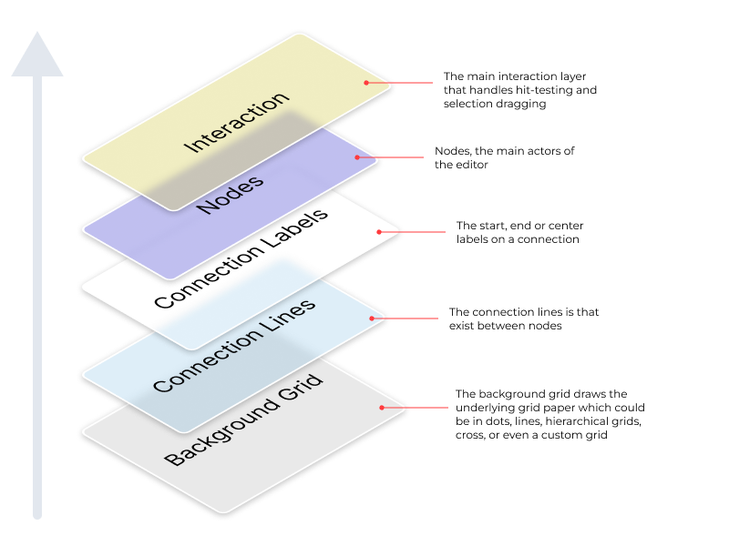
The editor uses a multi-layer rendering approach:
- Grid Layer: Background grid (dots or lines)
- Connections Layer: All connections between nodes
- Connection Labels Layer: Labels on connections
- Nodes Layer: Node widgets via custom builder
- Interaction Layer: Selection rectangles, temporary connections
Each layer is optimized independently for performance.
State Management
Vyuh Node Flow uses MobX for reactive state management:
- All mutable state is wrapped in
Observable - UI automatically updates when observables change
- No need for manual state synchronization
- Efficient change detection
Example:
final node = Node<MyData>(
  position: Offset(100, 100), // Wrapped in Observable internally
);

// Moving a node triggers automatic UI update
node.position.value = Offset(200, 200);
Event Flow
User interactions flow through the system like this:
User Action → Interaction Layer → Controller → Graph Model → MobX Reactions → UI UpdateExample: Moving a node
- User drags a node
- Interaction layer detects drag
- Calls
controller.moveNode() - Controller updates node position (Observable)
- MobX triggers reaction
- UI re-renders affected nodes
Extensibility Points
The architecture provides several extension points:
Core Customization
- Custom Node Data: Extend
NodeDatafor your domain - Node Builders: Provide custom node widgets for building the content as well as the container
- Annotations: Add custom overlays and markers
- Validators: Add connection validation logic
Theming
- Themes: Customize all visual aspects
- Connection Styles: Implement custom connection renderers like bezier, smoothstep, step, and straight
- Connection Effects: Add effects like flowing dashed lines, pulsing lines, moving arrows, particles, etc.
- Port Shapes: Leverage custom shapes to create endpoints and ports
- Grid Styles: Create custom grid styles. By default, you get dots, grid, hierarchical-grid, lines, and cross styles
- Node Shapes: Use built-in or custom shapes for node containers
Design Principles
- Separation of Concerns: Clear boundaries between layers
- Reactive: Automatic UI updates via MobX
- Type Safety: Generic types for compile-time safety
- Extensibility: Multiple extension points
- Performance: Optimized for large graphs
- Flutter-native: Built with Flutter best practices
Next Steps
- Learn about Nodes
- Explore Ports
- Understand Connections
- Deep dive into the Controller